WQOP Communications Plan
As a non-profit radio station, WQOP operates on a shoestring budget, so I decided to pitch in with a brand new logo and communications strategy. I was doing the work anyhow for my Master's coursework at the University of Florida, and I was determined to do some good along the way.

Background
WQOP broadcasts Catholic talk radio out of Jacksonville, FL. Station manager, Tom Moran, has juggled running the radio station, promoting it, and raising donations for several years. My goal was to increase awareness of the station within the local community and solicit donations.
Project Considerations
Queen of Peace Radio has a distinctly Catholic identity. Tom also told me that the board members wanted the visual elements to reflect a devotion to Mary, and that it should able to be used in black and white print. Past designers had tried and failed to design logos for the station, so I knew the logo would be an essential piece.
The Logo
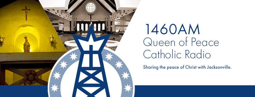
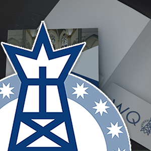
After several sketches, I decided to base the design on a broadcast tower to reflect the station’s central mission. A Cross sits atop the tower with a crown-like shape emanating outward. This shape reflects the royal imagery brought to mind by the station’s name, Queen of Peace Radio, but it also represents the broadcast of their Christian message. The ring of stars around the tower serve as another nod to the station’s namesake, St. Mary.
Social Media
Since Tom runs the station nearly on his own, any social media campaign would have to lightweight and easy to sustain. Luckily, the national programming aired by the station already created lots of quality online content, so the station’s social media channels could act as an aggregator for content generated by EWTN, Catholic Answers, and others. The station could also serve as a platform for announcing events around the Diocese of St. Augustine to give additional value to its core audience.
The station also produced a weekly live radio show that could be used to attract a social media following. Simply live streaming video of that show through Facebook or Youtube would allow WQOP to expand its listener base beyond the limits of its broadcast signal. At the same time, this would create shareable content to promote greater awareness of the station.

What people saw when they reached the WQOP was also important. Header imagery could be used to promote the Catholic identity of the station while also showing that are a part of the community. With that in mind, I developed a set of header images that combined images of local Catholic culture with the clean new look introduced with the new logo design.
Print Campaign
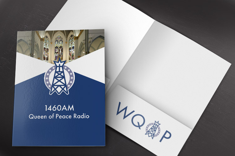
I also developed a few print pieces for Queen of Peace Radio. I knew that these were less likely to be used because of the printing costs, but don’t forget this project was an extension of my masters degree coursework. I wanted an A, too!
The print materials were designed as packets to be distributed at informational sessions at local Catholic events. Again the idea was to promote awareness among the stations core audience. You can see some of the pieces I produced in the gallery below.
Conclusion
In the end, WQOP decided to adopt the logo I had created, and they also adopted pieces of the social media strategy I put together. I offered my help to update their website as well, but Tom politely turned me down because he preferred to do that work for himself.