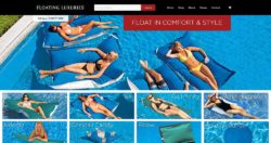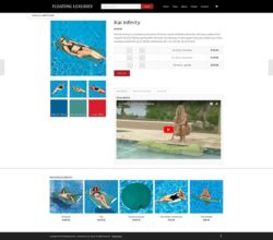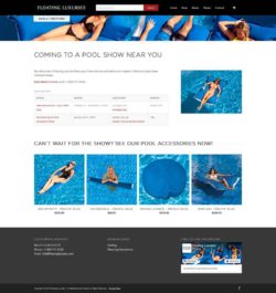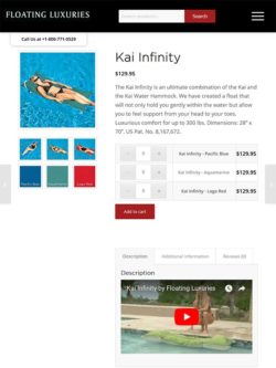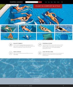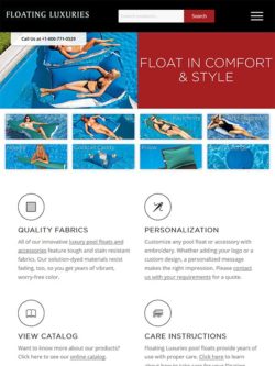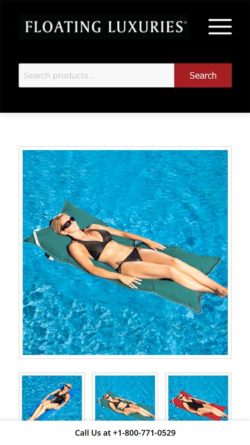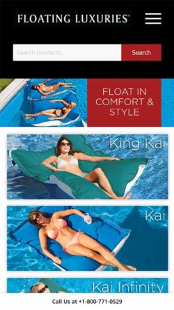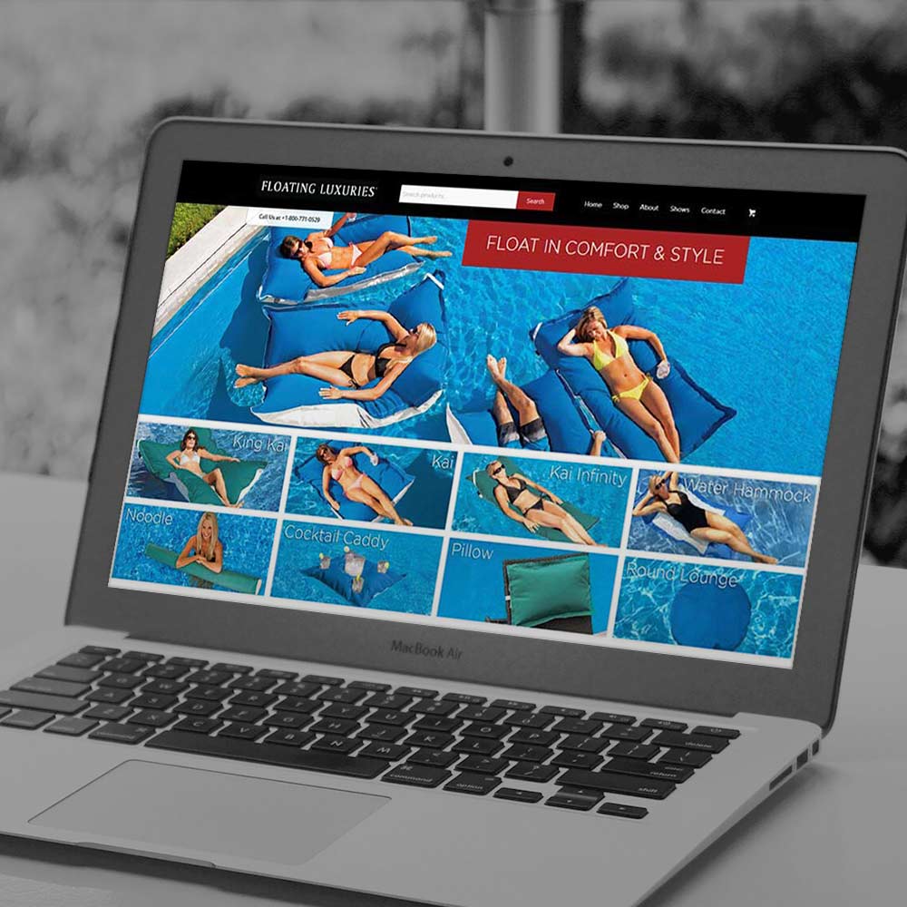
FloatingLuxuries.com
Some redesigns come together so smoothly it almost seems magical. This is not one of those projects. Redesigning FloatingLuxuries.com proved to be a challenge on many fronts, but I learned a lot about being a better web designer along the way.
The Backstory
Floating Luxuries manufactures and sells high-end pool floats to consumers and businesses worldwide. As with the redesign of ShopAdvantus.com, the site had been built on an outdated e-commerce platform called Product Cart. My company planned on moving the site to WordPress, and WooCommerce would then handle the e-commerce functionality.
My co-worker started the redesign several months before I came to work for the company, but she had run into a roadblock: the executive VP. She had created several quality versions of the homepage. None had managed to gain his approval. The project sat in limbo for months while more urgent projects came through the pipeline.
That’s Where I Come In
At the time I was hired, a baby boom had hit the company’s web efforts hard. Only two people handled the company websites, and both were out on maternity leave when I started. After they returned, my creative director decided to divide and conquer the backlog. At that point, I took over efforts to redesign FloatingLuxuries.com and a few other sites.
My co-worker, Kelly, quickly brought me up to speed. She explained that the executive VP (and co-owner of the parent corporation) had insisted that all products be shown on the homepage. This requirement complicated the layout. The design would need a
My Concerns
I also had concerns of my own. As its name states, Floating Luxuries identifies itself as a luxury brand, but the imagery did not support this brand perception. As a graphic designer, I also saw a disconnect between the message being sent by print media versus web media.
I also saw the site missing opportunities to expand the web market. With such a small web team managing so many sites, search engine optimization had been overlooked. This site was an opportunity to demonstrate how improving SEO could benefit the company all around.
Doing My Homework
When a user visits a site, they are not usually seeing it in isolation like a web designer. They have probably been shopping on other sites, or maybe they have been reading articles that interest them. They see the site in a broader context.
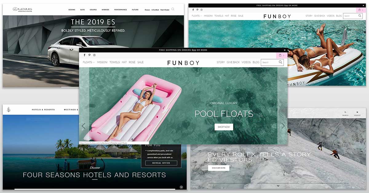
As a web designer I wanted the site to resonate with the target audience’s sensibilities yet stand out enough to demand their interest. This required research. I started by visiting sites of luxury hotels, cars, watches, and, of course, pool accessories. I noticed a few common traits:
- The imagery made people feel as though they were rising above the ordinary. They showed exotic destinations and experiences. The products existed in an exclusive, aspirational world apart.
- Simple, clean colors and fonts dominated. Sites tended to be heavy on pure white or black. The fonts tended to be sans serif with thin lines and very geometric.
- Detailed copy with lots of features listed helped justify spending more on products. This demographic likes access to lots of information on their purchases.
Keyword Research
Visual research yielded some information about how competitors view the demographic, but I decided to keep digging. I still needed to know our consumers’
Using Google’s keyword planner tool, I explored search volumes for keywords related to Floating Luxuries’ product line. This data provided a baseline to decide where it might be worthwhile to look deeper. Next, I evaluated keywords with adequate volume by their relevance to the products and their likelihood to lead to purchases.
I paid close attention to paid search bids, too, as I went through the data. This information allowed me to gauge the positioning of other brands and identify openings they had missed. As a long established brand, I could also predict how other companies might target us and shore up those areas.
The Marketing Director later asked me to conduct keyword and competitor research on several of the company’s brands. This initiative has led to more improvements in the company’s organic search optimization.
Initial Design
Armed with all of that information, I started fleshing out the actual design. The homepage would use the image of a high-rise infinity pool and patio. Product cards would take up part of the screen while a rotating headline in sleek lettering would run atop the background. I coded a slick hover effect for the cards and made everything responsive.
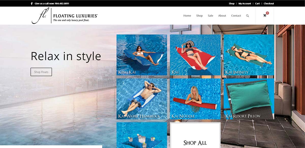
Further down users could read more about the proprietary features of the products. Then each product page would contain a plethora of information right down to the fabrics.
I felt confident about this design…until Kelly and
The Results
As much as I liked my own design, I have to admit that the site turned out better because of the input. After a few more rounds of feedback and revision, we finally came to a finished site which launched in summer 2018.
In the end, this site redesign did not go smoothly, but I needed the experience. My education helped me become technically proficient, but what classroom could teach me to work with someone like a demanding VP?
The Truth About Web Design
As a web designer, you need to be dedicated to your work without becoming too attached to it. Many young web designers take criticism personally because they see their work as an extension of themselves. The truth is just the opposite.
My work as a web designer revolves around others. I facilitate a conversation between a client and their audience. By taking the time to understand the company and their audience, I become a better facilitator. By listening and communicating, I become a better web designer.

