Improving Usability On McGillinc.com
How do you market a paper punch? It may be useful, but exciting? Not so much. This is the story of the redesign of McGillinc.com, and the steps I took to drive people to the site.
Why Bother?
The commercial office products industry has operated as a no frills enterprise for years, but the market is changing. Modern B2B commerce places increasing importance on appearance and usability.
The McGill website may have sufficed a decade ago, but it failed to meet the needs of businesses in 2018. For one thing, it lacked a search feature to easily find products. The home page also suffered from a visual overload as too many elements competed for attention without a hierarchy to guide visitors. McGill needed a change, but things are never that simple.
Double Duty
Strong sales through other channels and a low volume of site visitors relegated McGillinc.com to low priority status for years. The situation created an additional challenge: efficient use of time. Knowing that the payoff would likely be low, it made made sense to allocate more effort to other site redesigns that were happening at the same time.
My Creative Director had a solution. She challenged me with creating a site design that could be used on other sites with minimal modification. Since storagestudios.com presented a similar situation, it made a great partner for McGill. I would work on both sites simultaneously.
The Design
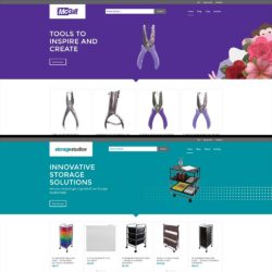
Both sites were created to run on WordPress and use WooCommerce to perform their e-commerce functions. Both sites use a child theme of the popular Enfold theme with extensive modifications made to each.
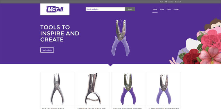
Luckily, both brands already had established color palettes coming into the project, and I used this fact my advantage. Both sites feature nearly identical layouts, but the strong colors and distinct visuals lend a different personality to each site.
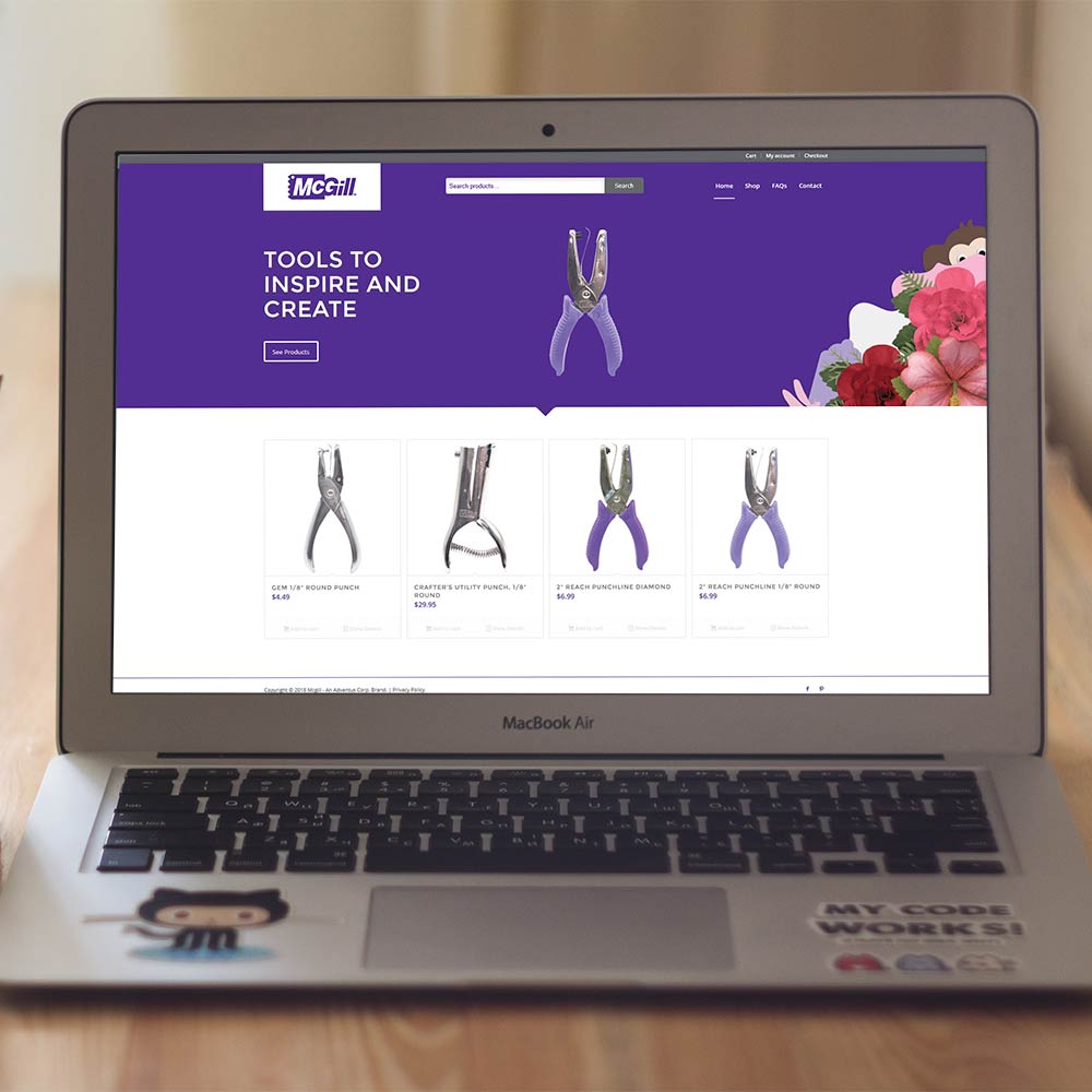
For McGill, I emphasized the use of the punches in craft projects. Static images of paper crafts made with McGill tools sit atop a purple background. Meanwhile the motion of products from the crafts towards the headline encourages visitors to engage with the main call to action.
Usability Features
Search Bar
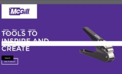
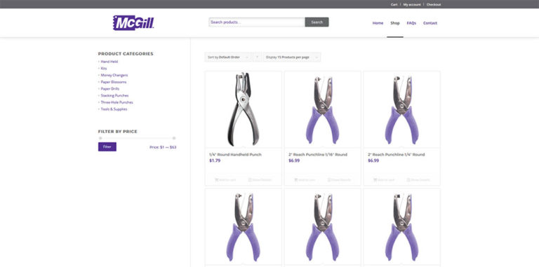
My Creative Director told me that I should prioritize improving the search functionality, so I started my usability improvements there. First, I added the built-in WordPress search widget to the header area to make sure it was hard to miss.
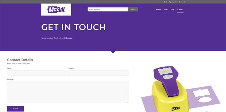
This created the basic markup, but, of course, the entire header needed styling before it was usable. For mobile screens, the base styles of the parent theme only needed minor tweaks to the positioning, but the desktop styles required more attention. By turning the header into a flexbox, I was able to use related properties to place the search field top center despite the normal page flow (see picture).
Reorganized FAQs
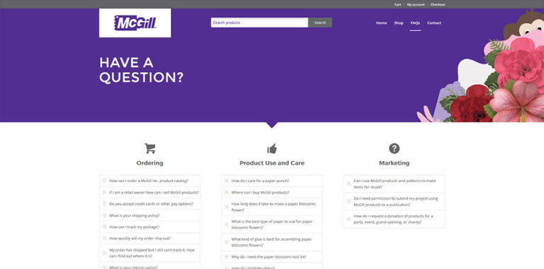
Before the redesign, the site FAQs were displayed as one long list which made finding pertinent answers hard. So I started by simplifying the display. I put everything into an accordion style display which hides the answers until the user clicks a question. This resulted in a lot less text to sort through.

I also organized the questions into categories, and I distributed the categories across the page in columns (on desktop). This move reduced the amount of scrolling needed to find a relevant question. To provide a visual cue, I also placed icons at the top of each column.
Other Improvements
The old McGill site suffered from low traffic, so driving more site visitors was also important to the success of this project. Given the low priority of the site compared to other company sites, I could not count on a bump from social media or paid advertising, so I focused my efforts here on organic search engine optimization (SEO).
Before I came to the company, little search optimization was occurring at all. This project kicked off a larger initiative I led to improve SEO across all company sites which I plan on writing about in a future post.
Conclusion
In the months since McGill relaunched, it has exceeded expectations. It has made a surprising amount of sales and traffic to the site is improving. Most of all, it has been transformed into a much more user friendly and focused site with its usability improvements.

