Creating Custom Hover Effects with CSS, Part 2
In the last installment of this series, I began walking you through planning your hover effects. We also scratched the surface of using positioning. Today we are going to dig into the CSS properties that make our hover effects come to life by adding movement.
CSS Positioning
If you remember part 1, we had an article element containing 4 children:
- An anchor element with an image
- An h2
- A paragraph with the class date
- A paragraph with no class
Relative Position
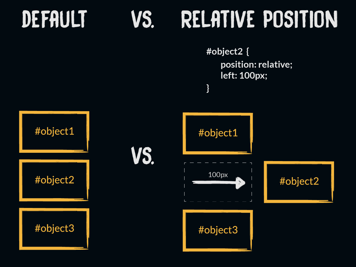
We used the position property to move these children where we wanted. Remember a position of relative essentially saves the space an element would have
Absolute Position
Absolute position works a bit differently. Setting the position property to absolute removes the element from the page flow. The other elements around it act as if the element with absolute position did not exist. So in the example below #object3 goes directly after #object1.
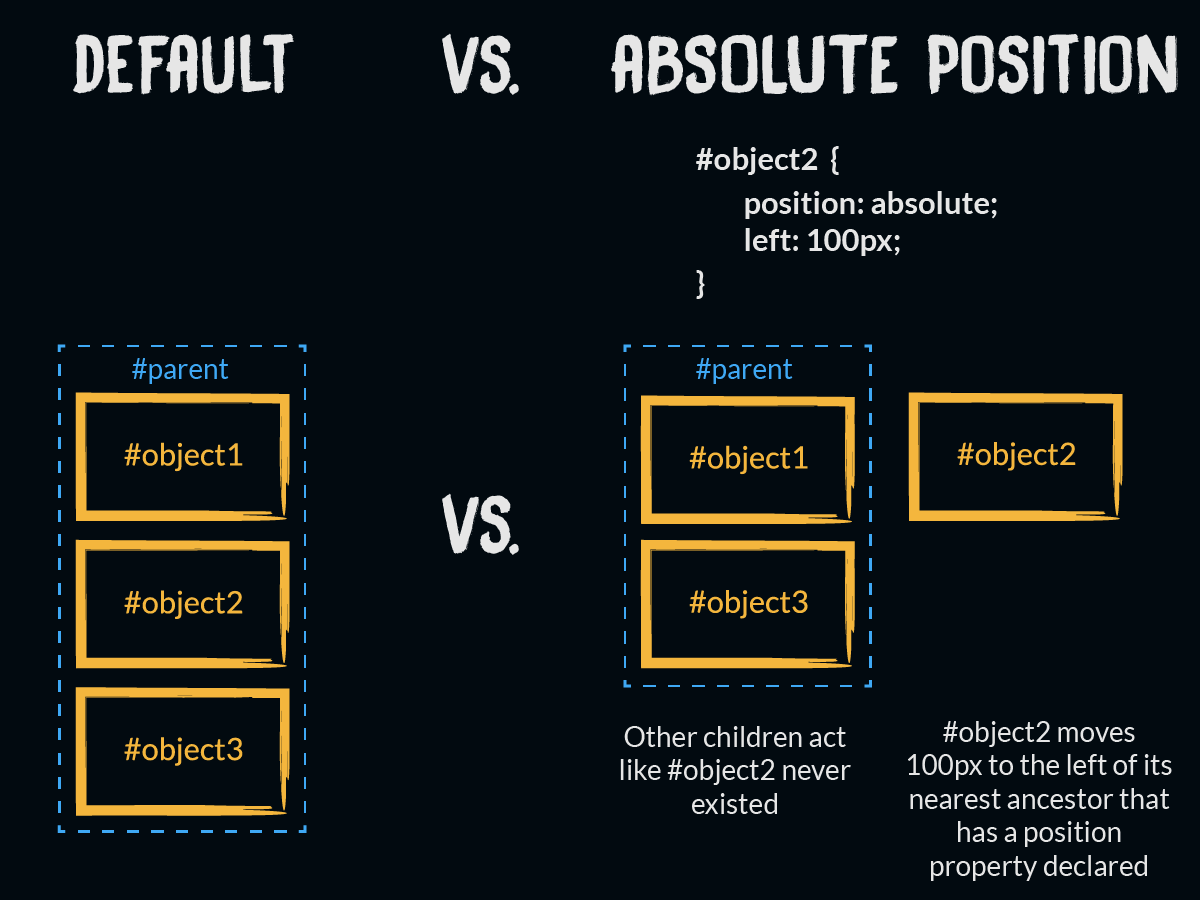
So where does #object2 go then? That answer depends on the elements it is contained within (its ancestors). The element will be positioned based on the nearest ancestor that has a position value declared (except position: static). If no ancestors are positioned, it will be positioned based on the outermost containing element.
Often I declare a position of relative on a parent element even though I don’t want to move it. Doing this sets up a predictable starting point for moving the children around that have a position of absolute.
From there absolute position works just like all the other position properties. Just add left, right, top, or bottom properties to nudge the element where you want it. In the example above, #object2 has moved 100 pixels from the left of the parent.
Dealing with Overlapping Elements
As elements get moved around, you will inevitably run in to overlapping elements. By default, the order will be set by the order of the HTML.
Think of it like you are flipping over playing cards from a deck and putting them in a stack. The top card from the deck gets flipped first, so it ends up on the bottom of the bottom of the new stack. The next card to be flipped goes on top of the first card and so on.
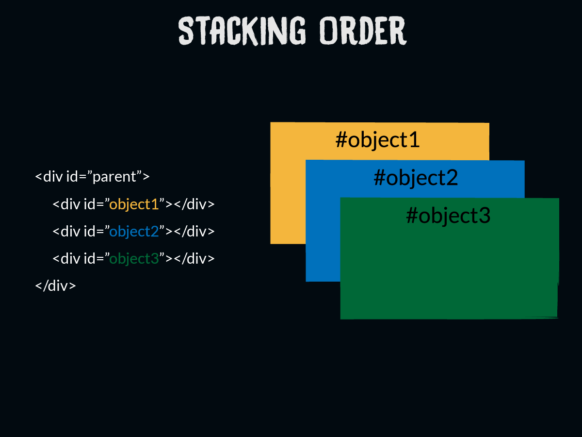
Similarly, the element that appears first would be stacked on the bottom because it’s processed first. The next element to appear in the HTML would go on top of the first if there is overlap caused by positioning.
Z-Index
Usually, it’s best to change the order of the HTML to control the stacking order, but sometimes this doesn’t make sense. For example, we wouldn’t want to put a paragraph before its accompanying heading. That would be terrible for accessibility. That’s why z-index exists.
The z-index property is used to change the default stacking order for overlapping elements. The concept is simple. Add the z-index property and assign a number value. Higher numbers will make objects go toward the top. So let’s consider the example below:
#objectA {
	z-index: 30;
}

#objectB {
	z-index: 50;
}

#objectC {
	z-index: 10;
}
In this example, #objectB would stack on top because it has a higher value in the z-index. The lowest z-index value belongs to #objectC, so it would go on bottom.
Also, notice that the values do not have to be consecutive. I prefer to give myself space a good amount of space between numbers to give myself wiggle room if another object ends up overlapping later.
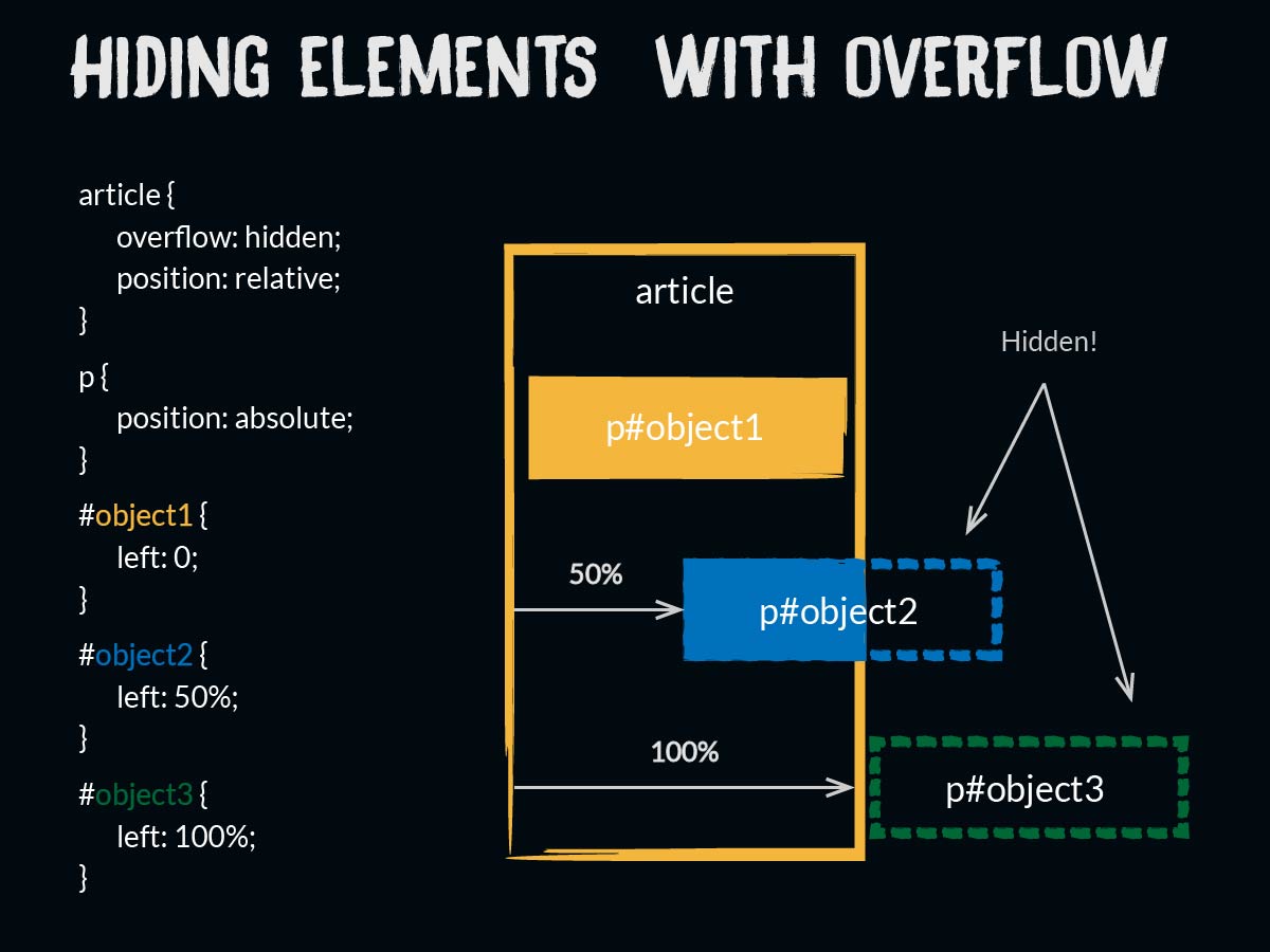
Controlling Overflow
The overflow property can also be useful in creating our hover effects. This property tells the browser what to do if the contents of an element are larger than the box containing them (remember the box model?).
 .blog article {
	overflow: hidden;
}
This property will apply to our effects because the article we want to add the hover effects to has a set width. By giving the overflow property a value of hidden, we can hide any content that is a child of the article but is positioned outside the article. More on this later.
Selecting Selectors
Without the right selectors, our hover effects will be all hover and no effect, so we ought to what to target and how.
It helps to picture what is happening before, during, and after the hover effect. Before the user hovers over our element, we will need a set of styles that act as our default state. Then we need a trigger that lets the browser know to initiate the effect. For us, this will be the when the cursor moves, or hovers, over the article element. When it does, a new set of styles will be applied.
The key event here is the hover over the article. We can use a psuedo-class to effectively listen for this event (article:hover). Since we don’t want to apply this effect to all the articles on the site, I am also going to specify the class that I’ve added to the body element on my blog index. So my base selector will be:
	.blog article:hover {
		/* Styles here */
	}
To add
	.blog article:hover h2 {
		/* Styles here */
	}
Depending on the HTML markup, combinators may also be needed to target an element. Combinators are symbols added to the code to target elements based on the context in which they appear. For instance, we could use the child combinator ( > ) to target elements that are immediate children of another element. Our effects do not require any combinators, but you can read more about them here.
Putting It All Together
At this point, we have all the tools we need to create a basic hover effect. First, we create a set of styles for how the article should look before the user hovers over the article just as you would style any other part of the page.
Then we create a set of styles for how the article should look in its hover state using the the selectors we just discussed to change a property setting. For instance, the code below shows how the left property changes on hover:
/* This is the position BEFORE the user hovers */
.blog article .date {
	left: 105%;
}

/* This is the position AFTER the user hovers */
.blog article:hover .date {
	left: 0;
}
You may wonder why I set the left value so high to start. Remember, we also set the overflow property to hidden. A left value of 105% pushes the date the entire width of its container from the left plus a little extra. Combining the overflow and left properties allows me to hide the date until the user hovers over the article.
CSS Transitions
By combining the properties with the right selectors, we can now move elements in and out of view, but the effect happens quite suddenly. We can use the transition property to add some polish to our effect.
The transition property animates the changing of a property’s values. For instance, when the user hovers the left value changes from 105% to 0. The transition property here would eliminate the sudden jump from one position to the other.
This property actually serves as a shorthand for a few related properties:
- transition-property: which property is being animated,
- transition-duration: how long should the transition take,
- transition-timing-function: will the movement happen evenly or will speed up and slow down at different points in the animation (optional),
- transition-delay: will the transition wait to begin (optional).
Here’s what transition looks like in the wild:
.blog article:hover .date:last-child {
	transition: left 0.5s;
}
Directly after the colon I tell the browser which property to animate (i.e. – the left property). Then I declare the transition duration in seconds (milliseconds work too). For this effect, I did not specify a timing function or delay, but had I wanted to these would have gone next.
Testing Your Hover Effects
As you set up these transitions and hover effects, take advantage of your preferred browser’s developer tools. Chances are if you are reading this tutorial you know at least something about developer tools, but you can read more about them here if not.
Transitions, in particular, require experimentation to find the best duration. Fractions of a second make a huge difference in the feel of an effect. The developer tools make it much easier to try different values.
To Be Continued…
Now you should know enough to get started building some basic hover effects. We learned how to use CSS position properties to move elements exactly where we want them, and how to use z-index to deal with overlap. You should be able to choose selectors to target the elements and states you want, and you can use transitions to finish off the effect.
Take a breath. We have covered a lot of ground, but this just touches on a few possibilities. In the last installment of this series, we’ll take a look at some of the effects used on this site, and I’ll offer some ideas about properties you might try in building your custom hover effects. See you then!
